


 ';
vedi
';
vedi
[rev_slider slidertitle=”Slider 2″ alias=”slider-2″]
[rev_slider slidertitle=”Slider 2″ alias=”slider-2″]
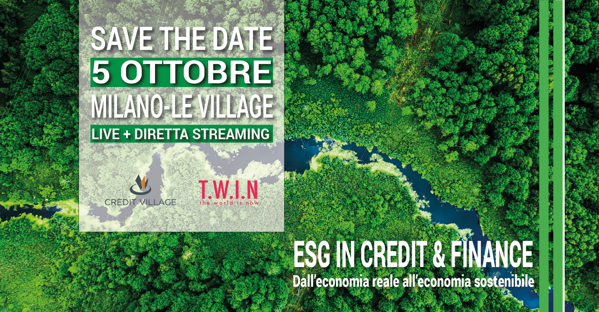
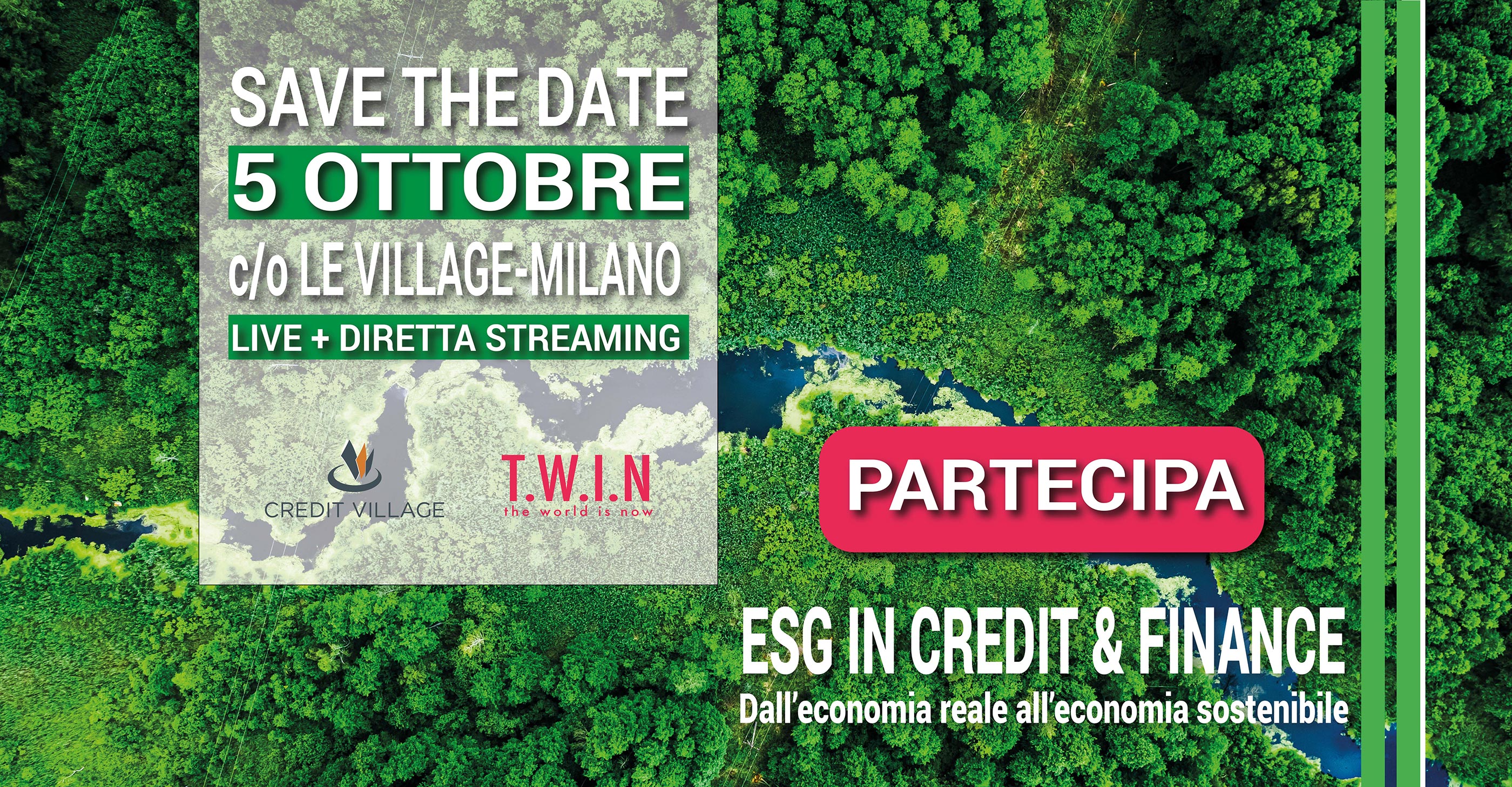
Tra le sfide epocali che i player del credito e della finanza dovranno affrontare nei prossimi anni figura anche quella dell’integrazione dei fattori ESG (Environmental, Social and Governance) nei modelli di business.
Quale sarà l’impatto che il settore finanziario ed economico dovrà attendersi dall’innesto dei temi della sostenibilità all’interno dei processi di questa industria? Come è possibile far convivere concetti quali Società Benefit e B-Corp con un settore che, nell’immaginario collettivo, è ancora molto legato strettamente alle performance di business?
A questi ed a molti altri quesiti risponderà il network di esperti, professionisti, istituzioni ed advisor creato da Credit Village e T.W.I.N in occasione di “ESG in credit&finance: dall’economia reale all’economia sostenibile”, evento che si terrà il 5 ottobre a Milano (Le Village) sia in forma fisica che in live streaming e che si propone di esplorare, per la prima volta in maniera dedicata ed esclusiva verso il settore creditizio, le relazioni tra le materie ESG e l’industria finanziaria.
Comitato scientifico:
Angelo Meda – Head of Equities, Portfolio Manager, BANOR SIM
Antonella Pagano – Managing Director, Accenture Italia
Federica Capuzzo – Senior Manager, Deloitte Italia
9:00 – 9:45
Registrazione Partecipanti e Welcome Networking Coffee
Modera Silvia Bernardi Giornalista
9:45 – 10:15
Saluto ai partecipanti e Opening Speech a cura di PierMario Barzaghi, Partner KPMG Advisory “L’evoluzione della normativa UE e gli impatti sulla strategia degli istituti finanziari e delle aziende”.
10:15 – 11:15
SESSION 1 “Be Sustainable: le banche a che punto sono?”
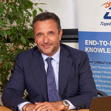
Keynote speech a cura di Simone Capecchi Executive Director CRIF
“ESG, Mito o Realtà”
Round Table
La tavola rotonda è dedicata al percorso di sostenibilità intrapreso dalle società, in modo particolare dalle banche, sia in termini di disclosure non finanziaria nelle loro comunicazioni ufficiali, guidato da una normativa comunitaria in primis e nazionale in seconda battuta, corpose e sfidanti, sia come strategia di investimento di medio, lungo periodo.
Una discussione per mettere in luce le opportunità e le difficoltà anche operative che l’essere sostenibili porta con sé. Si darà anche lo spazio all’esperienza concreta di una banca di medie dimensioni, che racconterà il proprio percorso del to “be sustainable”.
Intervengono:
PierMario Barzaghi, Partner KPMG Advisory
Isabella Falautano, Direttrice Comunicazione e Sostenibilità illimity
Gianluca Randazzo, Head of Sustainability Banca Mediolanum
Patrizia Sferrazza, Head of Communication, Media Relations & Marketing Banca Sistema
11:15 – 11:35
Case study Banco Desio
Intervista a Raffaele Negri, Responsabile area bilancio e sostenibilità Banco Desio
Modera: Federica Capuzzo, Senior Manager Divisione dei Sustainability Services Deloitte
11:35 – 12:25
SESSION 2 – Asset distressed e sostenibilità
Round Table
Le nuove frontiere rigenerative dei distressed credits, come energy e real estate possono contribuire alla costruzione di un modello finanziario sostenibile
Intervengono:
Francesca Fiorini, Consigliere Delegato AT NPL’s SPA
Marco Gerevini, Consigliere Delegato Fondazione Housing Sociale
Elena Maspoli, Head of Special Situations Energy illimity
Silvia Rovere, Presidente Confindustria Assoimmobiliare
12:25 – 12:40
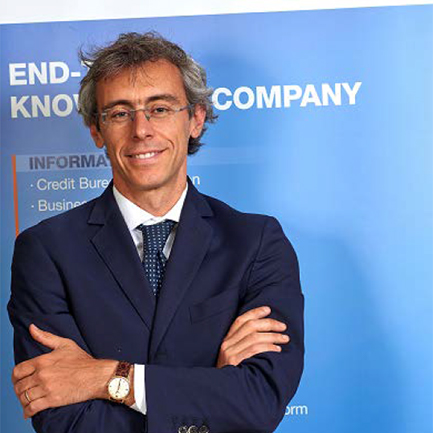
Overview: Gli strumenti green nella finanza immobiliare a cura di Manuela Di Marino, Senior Director Cross Business Development & Commercial Planning RINA PRIME Value Services
12:40 – 13:00
Q&A
13:00 – 14:00
Networking Lunch
14:00 – 15:00
SESSION 3 – Go Sustainable: quali azioni e prodotti possono essere messi in campo dagli Istituti per poter incentivare l’adozione di un percorso di sostenibilità da parte delle aziende (PMI)
Round Table
La transizione verso un’economia sostenibile rappresenta un obiettivo strategico dell’ecosistema che richiede un profondo ripensamento da parte delle aziende delle modalità di fare business e cospicui investimenti. Accompagnare la propria clientela in questo percorso rappresenta una opportunità di business significativa per le banche, che agiranno anche come cinghia di trasmissione sulla comunità, a partire dagli ingenti fondi pubblici stanziati nel Piano Nazionale di Ripresa e Resilienza (“PNRR”).
Intervengono:
Marzio Cichetti, Head of Vendor Development Open-es Powered by Eni
Giorgio Costantino, Executive Director – Global Transformation Services CRIF
Andrea Florio, CFO & Chief Business Finanziaria Internazionale Investments SGR
Antonella Pagano, Managing Director Accenture
Giovanna Zacchi, Head of ESG Strategy Bper Banca
15:00 – 15:45
SESSION 4 – “Asset class ESG: quanti e quali sono gli strumenti sostenibili su cui investire”
Il mondo degli investitori finanziari parla sempre più di sostenibilità, ma come vengono integrate considerazioni e decisioni su tematiche ESG nella gestione di un prodotto azionario, obbligazionario o alternativo? Esistono dei copioni pre-stabiliti oppure ogni singolo investitore ha la sua definizione e il suo processo? In quest’ultimo caso, come possiamo essere sicuri dell’implementazione effettiva e che non sia solo un elemento di marketing? Queste sono le domande che il mercato finanziario si pone in questo momento, caratterizzato da una forte spinta sulle tematiche di sostenibilità, ma anche dalle prime indagini da parte dei regolatori sull’effettiva implementazione di strategie ESG”
Intervengono:
Roberto Del Giudice, Direttore Commerciale, Investor Relations & ESG Fondo Italiano d’Investimento SGR
Elena Ferrarese, Head of Italian Equity Amundi SGR
Andrea Florio, CFO & Chief Business Finanziaria Internazionale Investments SGR
Angelo Meda, Head of Equities Portfolio Manager Banor SIM
Maurizio Tacchella, Direttore Banca Depositaria, BFF Bank
15:45 – 16:00
Q&A e Chiusura lavori


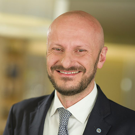
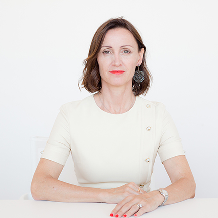
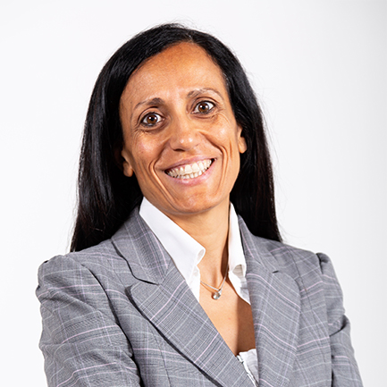
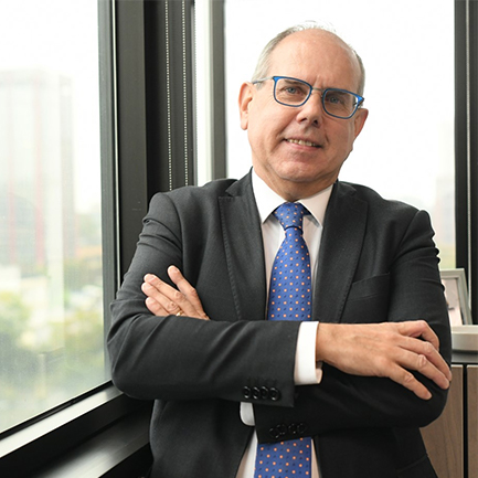
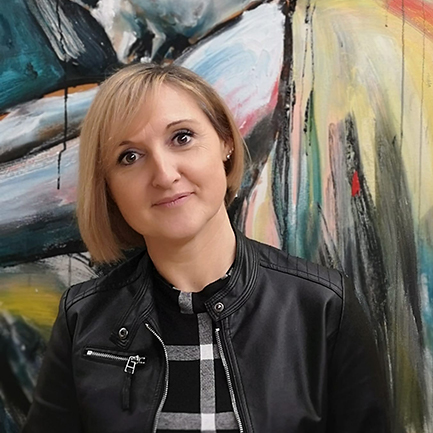
Ecco gli speaker che prenderanno parte alla prima edizione della ESG Conference.
';
vedi
 ';
vedi
';
vedi
 ';
vedi
';
vedi
 ';
vedi
';
vedi
 ';
vedi
';
vedi
 ';
vedi
';
vedi
 ';
vedi
';
vedi
Direttore Commerciale, Investor Relations & ESG
Fondo Italiano d'Investimento SGR
 ';
vedi
';
vedi
Senior Director Cross Business Development & Commercial Planning
RINA Prime Value Services
 ';
vedi
';
vedi
 ';
vedi
';
vedi
 ';
vedi
';
vedi
 ';
vedi
';
vedi
 ';
vedi
';
vedi
 ';
vedi
';
vedi
 ';
vedi
';
vedi
 ';
vedi
';
vedi
 ';
vedi
';
vedi
 ';
vedi
';
vedi
 ';
vedi
';
vedi
 ';
vedi
';
vedi
 ';
vedi
';
vedi
 ';
vedi
';
vedi
} @media only screen and (max-width: 480px){
body,table,td,p,a,li,blockquote{
-webkit-text-size-adjust:none !important;
}
} @media only screen and (max-width: 480px){
body{
width:100% !important;
min-width:100% !important;
}
} @media only screen and (max-width: 480px){
.mcnRetinaImage{
max-width:100% !important;
}
} @media only screen and (max-width: 480px){
.mcnImage{
width:100% !important;
}
} @media only screen and (max-width: 480px){
.mcnCartContainer,.mcnCaptionTopContent,.mcnRecContentContainer,.mcnCaptionBottomContent,.mcnTextContentContainer,.mcnBoxedTextContentContainer,.mcnImageGroupContentContainer,.mcnCaptionLeftTextContentContainer,.mcnCaptionRightTextContentContainer,.mcnCaptionLeftImageContentContainer,.mcnCaptionRightImageContentContainer,.mcnImageCardLeftTextContentContainer,.mcnImageCardRightTextContentContainer,.mcnImageCardLeftImageContentContainer,.mcnImageCardRightImageContentContainer{
max-width:100% !important;
width:100% !important;
}
} @media only screen and (max-width: 480px){
.mcnBoxedTextContentContainer{
min-width:100% !important;
}
} @media only screen and (max-width: 480px){
.mcnImageGroupContent{
padding:9px !important;
}
} @media only screen and (max-width: 480px){
.mcnCaptionLeftContentOuter .mcnTextContent,.mcnCaptionRightContentOuter .mcnTextContent{
padding-top:9px !important;
}
} @media only screen and (max-width: 480px){
.mcnImageCardTopImageContent,.mcnCaptionBottomContent:last-child .mcnCaptionBottomImageContent,.mcnCaptionBlockInner .mcnCaptionTopContent:last-child .mcnTextContent{
padding-top:18px !important;
}
} @media only screen and (max-width: 480px){
.mcnImageCardBottomImageContent{
padding-bottom:9px !important;
}
} @media only screen and (max-width: 480px){
.mcnImageGroupBlockInner{
padding-top:0 !important;
padding-bottom:0 !important;
}
} @media only screen and (max-width: 480px){
.mcnImageGroupBlockOuter{
padding-top:9px !important;
padding-bottom:9px !important;
}
} @media only screen and (max-width: 480px){
.mcnTextContent,.mcnBoxedTextContentColumn{
padding-right:18px !important;
padding-left:18px !important;
}
} @media only screen and (max-width: 480px){
.mcnImageCardLeftImageContent,.mcnImageCardRightImageContent{
padding-right:18px !important;
padding-bottom:0 !important;
padding-left:18px !important;
}
} @media only screen and (max-width: 480px){
.mcpreview-image-uploader{
display:none !important;
width:100% !important;
}
} @media only screen and (max-width: 480px){
h1{
font-size:22px !important;
line-height:125% !important;
}
} @media only screen and (max-width: 480px){
h2{
font-size:20px !important;
line-height:125% !important;
}
} @media only screen and (max-width: 480px){
h3{
font-size:18px !important;
line-height:125% !important;
}
} @media only screen and (max-width: 480px){
h4{
font-size:16px !important;
line-height:150% !important;
}
} @media only screen and (max-width: 480px){
.mcnBoxedTextContentContainer .mcnTextContent,.mcnBoxedTextContentContainer .mcnTextContent p{
font-size:14px !important;
line-height:150% !important;
}
} @media only screen and (max-width: 480px){
#templatePreheader{
display:block !important;
}
} @media only screen and (max-width: 480px){
#templatePreheader .mcnTextContent,#templatePreheader .mcnTextContent p{
font-size:14px !important;
line-height:150% !important;
}
} @media only screen and (max-width: 480px){
#templateHeader .mcnTextContent,#templateHeader .mcnTextContent p{
font-size:16px !important;
line-height:150% !important;
}
} @media only screen and (max-width: 480px){
#templateBody .mcnTextContent,#templateBody .mcnTextContent p{
font-size:16px !important;
line-height:150% !important;
}
} @media only screen and (max-width: 480px){
#templateFooter .mcnTextContent,#templateFooter .mcnTextContent p{
font-size:14px !important;
line-height:150% !important;
}
}
<!--
|
} @media only screen and (max-width: 480px){
body,table,td,p,a,li,blockquote{
-webkit-text-size-adjust:none !important;
}
} @media only screen and (max-width: 480px){
body{
width:100% !important;
min-width:100% !important;
}
} @media only screen and (max-width: 480px){
.mcnRetinaImage{
max-width:100% !important;
}
} @media only screen and (max-width: 480px){
.mcnImage{
width:100% !important;
}
} @media only screen and (max-width: 480px){
.mcnCartContainer,.mcnCaptionTopContent,.mcnRecContentContainer,.mcnCaptionBottomContent,.mcnTextContentContainer,.mcnBoxedTextContentContainer,.mcnImageGroupContentContainer,.mcnCaptionLeftTextContentContainer,.mcnCaptionRightTextContentContainer,.mcnCaptionLeftImageContentContainer,.mcnCaptionRightImageContentContainer,.mcnImageCardLeftTextContentContainer,.mcnImageCardRightTextContentContainer,.mcnImageCardLeftImageContentContainer,.mcnImageCardRightImageContentContainer{
max-width:100% !important;
width:100% !important;
}
} @media only screen and (max-width: 480px){
.mcnBoxedTextContentContainer{
min-width:100% !important;
}
} @media only screen and (max-width: 480px){
.mcnImageGroupContent{
padding:9px !important;
}
} @media only screen and (max-width: 480px){
.mcnCaptionLeftContentOuter .mcnTextContent,.mcnCaptionRightContentOuter .mcnTextContent{
padding-top:9px !important;
}
} @media only screen and (max-width: 480px){
.mcnImageCardTopImageContent,.mcnCaptionBottomContent:last-child .mcnCaptionBottomImageContent,.mcnCaptionBlockInner .mcnCaptionTopContent:last-child .mcnTextContent{
padding-top:18px !important;
}
} @media only screen and (max-width: 480px){
.mcnImageCardBottomImageContent{
padding-bottom:9px !important;
}
} @media only screen and (max-width: 480px){
.mcnImageGroupBlockInner{
padding-top:0 !important;
padding-bottom:0 !important;
}
} @media only screen and (max-width: 480px){
.mcnImageGroupBlockOuter{
padding-top:9px !important;
padding-bottom:9px !important;
}
} @media only screen and (max-width: 480px){
.mcnTextContent,.mcnBoxedTextContentColumn{
padding-right:18px !important;
padding-left:18px !important;
}
} @media only screen and (max-width: 480px){
.mcnImageCardLeftImageContent,.mcnImageCardRightImageContent{
padding-right:18px !important;
padding-bottom:0 !important;
padding-left:18px !important;
}
} @media only screen and (max-width: 480px){
.mcpreview-image-uploader{
display:none !important;
width:100% !important;
}
} @media only screen and (max-width: 480px){
h1{
font-size:22px !important;
line-height:125% !important;
}
} @media only screen and (max-width: 480px){
h2{
font-size:20px !important;
line-height:125% !important;
}
} @media only screen and (max-width: 480px){
h3{
font-size:18px !important;
line-height:125% !important;
}
} @media only screen and (max-width: 480px){
h4{
font-size:16px !important;
line-height:150% !important;
}
} @media only screen and (max-width: 480px){
.mcnBoxedTextContentContainer .mcnTextContent,.mcnBoxedTextContentContainer .mcnTextContent p{
font-size:14px !important;
line-height:150% !important;
}
} @media only screen and (max-width: 480px){
#templatePreheader{
display:block !important;
}
} @media only screen and (max-width: 480px){
#templatePreheader .mcnTextContent,#templatePreheader .mcnTextContent p{
font-size:14px !important;
line-height:150% !important;
}
} @media only screen and (max-width: 480px){
#templateHeader .mcnTextContent,#templateHeader .mcnTextContent p{
font-size:16px !important;
line-height:150% !important;
}
} @media only screen and (max-width: 480px){
#templateBody .mcnTextContent,#templateBody .mcnTextContent p{
font-size:16px !important;
line-height:150% !important;
}
} @media only screen and (max-width: 480px){
#templateFooter .mcnTextContent,#templateFooter .mcnTextContent p{
font-size:14px !important;
line-height:150% !important;
}
}
<!--
|
96
} @media only screen and (max-width: 480px){
body,table,td,p,a,li,blockquote{
-webkit-text-size-adjust:none !important;
}
} @media only screen and (max-width: 480px){
body{
width:100% !important;
min-width:100% !important;
}
} @media only screen and (max-width: 480px){
.mcnRetinaImage{
max-width:100% !important;
}
} @media only screen and (max-width: 480px){
.mcnImage{
width:100% !important;
}
} @media only screen and (max-width: 480px){
.mcnCartContainer,.mcnCaptionTopContent,.mcnRecContentContainer,.mcnCaptionBottomContent,.mcnTextContentContainer,.mcnBoxedTextContentContainer,.mcnImageGroupContentContainer,.mcnCaptionLeftTextContentContainer,.mcnCaptionRightTextContentContainer,.mcnCaptionLeftImageContentContainer,.mcnCaptionRightImageContentContainer,.mcnImageCardLeftTextContentContainer,.mcnImageCardRightTextContentContainer,.mcnImageCardLeftImageContentContainer,.mcnImageCardRightImageContentContainer{
max-width:100% !important;
width:100% !important;
}
} @media only screen and (max-width: 480px){
.mcnBoxedTextContentContainer{
min-width:100% !important;
}
} @media only screen and (max-width: 480px){
.mcnImageGroupContent{
padding:9px !important;
}
} @media only screen and (max-width: 480px){
.mcnCaptionLeftContentOuter .mcnTextContent,.mcnCaptionRightContentOuter .mcnTextContent{
padding-top:9px !important;
}
} @media only screen and (max-width: 480px){
.mcnImageCardTopImageContent,.mcnCaptionBottomContent:last-child .mcnCaptionBottomImageContent,.mcnCaptionBlockInner .mcnCaptionTopContent:last-child .mcnTextContent{
padding-top:18px !important;
}
} @media only screen and (max-width: 480px){
.mcnImageCardBottomImageContent{
padding-bottom:9px !important;
}
} @media only screen and (max-width: 480px){
.mcnImageGroupBlockInner{
padding-top:0 !important;
padding-bottom:0 !important;
}
} @media only screen and (max-width: 480px){
.mcnImageGroupBlockOuter{
padding-top:9px !important;
padding-bottom:9px !important;
}
} @media only screen and (max-width: 480px){
.mcnTextContent,.mcnBoxedTextContentColumn{
padding-right:18px !important;
padding-left:18px !important;
}
} @media only screen and (max-width: 480px){
.mcnImageCardLeftImageContent,.mcnImageCardRightImageContent{
padding-right:18px !important;
padding-bottom:0 !important;
padding-left:18px !important;
}
} @media only screen and (max-width: 480px){
.mcpreview-image-uploader{
display:none !important;
width:100% !important;
}
} @media only screen and (max-width: 480px){
h1{
font-size:22px !important;
line-height:125% !important;
}
} @media only screen and (max-width: 480px){
h2{
font-size:20px !important;
line-height:125% !important;
}
} @media only screen and (max-width: 480px){
h3{
font-size:18px !important;
line-height:125% !important;
}
} @media only screen and (max-width: 480px){
h4{
font-size:16px !important;
line-height:150% !important;
}
} @media only screen and (max-width: 480px){
.mcnBoxedTextContentContainer .mcnTextContent,.mcnBoxedTextContentContainer .mcnTextContent p{
font-size:14px !important;
line-height:150% !important;
}
} @media only screen and (max-width: 480px){
#templatePreheader{
display:block !important;
}
} @media only screen and (max-width: 480px){
#templatePreheader .mcnTextContent,#templatePreheader .mcnTextContent p{
font-size:14px !important;
line-height:150% !important;
}
} @media only screen and (max-width: 480px){
#templateHeader .mcnTextContent,#templateHeader .mcnTextContent p{
font-size:16px !important;
line-height:150% !important;
}
} @media only screen and (max-width: 480px){
#templateBody .mcnTextContent,#templateBody .mcnTextContent p{
font-size:16px !important;
line-height:150% !important;
}
} @media only screen and (max-width: 480px){
#templateFooter .mcnTextContent,#templateFooter .mcnTextContent p{
font-size:14px !important;
line-height:150% !important;
}
}
<!--
|
@media only screen and (max-width: 480px){
p{
margin:10px 0;
padding:0;
}
table{
border-collapse:collapse;
}
h1,h2,h3,h4,h5,h6{
display:block;
margin:0;
padding:0;
}
img,a img{
border:0;
height:auto;
outline:none;
text-decoration:none;
}
body,#bodyTable,#bodyCell{
height:100%;
margin:0;
padding:0;
width:100%;
}
.mcnPreviewText{
display:none !important;
}
#outlook a{
padding:0;
}
img{
-ms-interpolation-mode:bicubic;
}
table{
mso-table-lspace:0pt;
mso-table-rspace:0pt;
}
.ReadMsgBody{
width:100%;
}
.ExternalClass{
width:100%;
}
p,a,li,td,blockquote{
mso-line-height-rule:exactly;
}
a[href^=tel],a[href^=sms]{
color:inherit;
cursor:default;
text-decoration:none;
}
p,a,li,td,body,table,blockquote{
-ms-text-size-adjust:100%;
-webkit-text-size-adjust:100%;
}
.ExternalClass,.ExternalClass p,.ExternalClass td,.ExternalClass div,.ExternalClass span,.ExternalClass font{
line-height:100%;
}
a[x-apple-data-detectors]{
color:inherit !important;
text-decoration:none !important;
font-size:inherit !important;
font-family:inherit !important;
font-weight:inherit !important;
line-height:inherit !important;
}
#bodyCell{
padding:10px;
}
.templateContainer{
max-width:600px !important;
}
a.mcnButton{
display:block;
}
.mcnImage,.mcnRetinaImage{
vertical-align:bottom;
}
.mcnTextContent{
word-break:break-word;
}
.mcnTextContent img{
height:auto !important;
}
.mcnDividerBlock{
table-layout:fixed !important;
}
body,#bodyTable{
background-color:#ffffff;
}
#bodyCell{
border-top:0;
}
.templateContainer{
border:0;
}
h1{
color:#202020;
font-family:Helvetica;
font-size:26px;
font-style:normal;
font-weight:bold;
line-height:125%;
letter-spacing:normal;
text-align:left;
}
h2{
color:#202020;
font-family:Helvetica;
font-size:22px;
font-style:normal;
font-weight:bold;
line-height:125%;
letter-spacing:normal;
text-align:left;
}
h3{
color:#202020;
font-family:Helvetica;
font-size:20px;
font-style:normal;
font-weight:bold;
line-height:125%;
letter-spacing:normal;
text-align:left;
}
h4{
color:#202020;
font-family:Helvetica;
font-size:18px;
font-style:normal;
font-weight:bold;
line-height:125%;
letter-spacing:normal;
text-align:left;
}
#templatePreheader{
background-color:#ffffff;
background-image:none;
background-repeat:no-repeat;
background-position:center;
background-size:cover;
border-top:0;
border-bottom:0;
padding-top:9px;
padding-bottom:9px;
}
#templatePreheader .mcnTextContent,#templatePreheader .mcnTextContent p{
color:#656565;
font-family:Helvetica;
font-size:12px;
line-height:150%;
text-align:left;
}
#templatePreheader .mcnTextContent a,#templatePreheader .mcnTextContent p a{
color:#656565;
font-weight:normal;
text-decoration:underline;
}
#templateHeader{
background-color:#ffffff;
background-image:none;
background-repeat:no-repeat;
background-position:center;
background-size:cover;
border-top:0;
border-bottom:0;
padding-top:9px;
padding-bottom:0;
}
#templateHeader .mcnTextContent,#templateHeader .mcnTextContent p{
color:#202020;
font-family:Helvetica;
font-size:16px;
line-height:150%;
text-align:left;
}
#templateHeader .mcnTextContent a,#templateHeader .mcnTextContent p a{
color:#007C89;
font-weight:normal;
text-decoration:underline;
}
#templateBody{
background-color:#ffffff;
background-image:none;
background-repeat:no-repeat;
background-position:center;
background-size:cover;
border-top:0;
border-bottom:2px solid #EAEAEA;
padding-top:0;
padding-bottom:9px;
}
#templateBody .mcnTextContent,#templateBody .mcnTextContent p{
color:#202020;
font-family:Helvetica;
font-size:16px;
line-height:150%;
text-align:left;
}
#templateBody .mcnTextContent a,#templateBody .mcnTextContent p a{
color:#007C89;
font-weight:normal;
text-decoration:underline;
}
#templateFooter{
background-color:#ffffff;
background-image:none;
background-repeat:no-repeat;
background-position:center;
background-size:cover;
border-top:0;
border-bottom:0;
padding-top:9px;
padding-bottom:9px;
}
#templateFooter .mcnTextContent,#templateFooter .mcnTextContent p{
color:#656565;
font-family:Helvetica;
font-size:12px;
line-height:150%;
text-align:center;
}
#templateFooter .mcnTextContent a,#templateFooter .mcnTextContent p a{
color:#656565;
font-weight:normal;
text-decoration:underline;
}
@media only screen and (min-width:768px){
.templateContainer{
width:600px !important;
}
} @media only screen and (max-width: 480px){
body,table,td,p,a,li,blockquote{
-webkit-text-size-adjust:none !important;
}
} @media only screen and (max-width: 480px){
body{
width:100% !important;
min-width:100% !important;
}
} @media only screen and (max-width: 480px){
.mcnRetinaImage{
max-width:100% !important;
}
} @media only screen and (max-width: 480px){
.mcnImage{
width:100% !important;
}
} @media only screen and (max-width: 480px){
.mcnCartContainer,.mcnCaptionTopContent,.mcnRecContentContainer,.mcnCaptionBottomContent,.mcnTextContentContainer,.mcnBoxedTextContentContainer,.mcnImageGroupContentContainer,.mcnCaptionLeftTextContentContainer,.mcnCaptionRightTextContentContainer,.mcnCaptionLeftImageContentContainer,.mcnCaptionRightImageContentContainer,.mcnImageCardLeftTextContentContainer,.mcnImageCardRightTextContentContainer,.mcnImageCardLeftImageContentContainer,.mcnImageCardRightImageContentContainer{
max-width:100% !important;
width:100% !important;
}
} @media only screen and (max-width: 480px){
.mcnBoxedTextContentContainer{
min-width:100% !important;
}
} @media only screen and (max-width: 480px){
.mcnImageGroupContent{
padding:9px !important;
}
} @media only screen and (max-width: 480px){
.mcnCaptionLeftContentOuter .mcnTextContent,.mcnCaptionRightContentOuter .mcnTextContent{
padding-top:9px !important;
}
} @media only screen and (max-width: 480px){
.mcnImageCardTopImageContent,.mcnCaptionBottomContent:last-child .mcnCaptionBottomImageContent,.mcnCaptionBlockInner .mcnCaptionTopContent:last-child .mcnTextContent{
padding-top:18px !important;
}
} @media only screen and (max-width: 480px){
.mcnImageCardBottomImageContent{
padding-bottom:9px !important;
}
} @media only screen and (max-width: 480px){
.mcnImageGroupBlockInner{
padding-top:0 !important;
padding-bottom:0 !important;
}
} @media only screen and (max-width: 480px){
.mcnImageGroupBlockOuter{
padding-top:9px !important;
padding-bottom:9px !important;
}
} @media only screen and (max-width: 480px){
.mcnTextContent,.mcnBoxedTextContentColumn{
padding-right:18px !important;
padding-left:18px !important;
}
} @media only screen and (max-width: 480px){
.mcnImageCardLeftImageContent,.mcnImageCardRightImageContent{
padding-right:18px !important;
padding-bottom:0 !important;
padding-left:18px !important;
}
} @media only screen and (max-width: 480px){
.mcpreview-image-uploader{
display:none !important;
width:100% !important;
}
} @media only screen and (max-width: 480px){
h1{
font-size:22px !important;
line-height:125% !important;
}
} @media only screen and (max-width: 480px){
h2{
font-size:20px !important;
line-height:125% !important;
}
} @media only screen and (max-width: 480px){
h3{
font-size:18px !important;
line-height:125% !important;
}
} @media only screen and (max-width: 480px){
h4{
font-size:16px !important;
line-height:150% !important;
}
} @media only screen and (max-width: 480px){
.mcnBoxedTextContentContainer .mcnTextContent,.mcnBoxedTextContentContainer .mcnTextContent p{
font-size:14px !important;
line-height:150% !important;
}
} @media only screen and (max-width: 480px){
#templatePreheader{
display:block !important;
}
} @media only screen and (max-width: 480px){
#templatePreheader .mcnTextContent,#templatePreheader .mcnTextContent p{
font-size:14px !important;
line-height:150% !important;
}
} @media only screen and (max-width: 480px){
#templateHeader .mcnTextContent,#templateHeader .mcnTextContent p{
font-size:16px !important;
line-height:150% !important;
}
} @media only screen and (max-width: 480px){
#templateBody .mcnTextContent,#templateBody .mcnTextContent p{
font-size:16px !important;
line-height:150% !important;
}
} @media only screen and (max-width: 480px){
#templateFooter .mcnTextContent,#templateFooter .mcnTextContent p{
font-size:14px !important;
line-height:150% !important;
}
}
<!--
|
96
p{
margin:10px 0;
padding:0;
}
table{
border-collapse:collapse;
}
h1,h2,h3,h4,h5,h6{
display:block;
margin:0;
padding:0;
}
img,a img{
border:0;
height:auto;
outline:none;
text-decoration:none;
}
body,#bodyTable,#bodyCell{
height:100%;
margin:0;
padding:0;
width:100%;
}
.mcnPreviewText{
display:none !important;
}
#outlook a{
padding:0;
}
img{
-ms-interpolation-mode:bicubic;
}
table{
mso-table-lspace:0pt;
mso-table-rspace:0pt;
}
.ReadMsgBody{
width:100%;
}
.ExternalClass{
width:100%;
}
p,a,li,td,blockquote{
mso-line-height-rule:exactly;
}
a[href^=tel],a[href^=sms]{
color:inherit;
cursor:default;
text-decoration:none;
}
p,a,li,td,body,table,blockquote{
-ms-text-size-adjust:100%;
-webkit-text-size-adjust:100%;
}
.ExternalClass,.ExternalClass p,.ExternalClass td,.ExternalClass div,.ExternalClass span,.ExternalClass font{
line-height:100%;
}
a[x-apple-data-detectors]{
color:inherit !important;
text-decoration:none !important;
font-size:inherit !important;
font-family:inherit !important;
font-weight:inherit !important;
line-height:inherit !important;
}
#bodyCell{
padding:10px;
}
.templateContainer{
max-width:600px !important;
}
a.mcnButton{
display:block;
}
.mcnImage,.mcnRetinaImage{
vertical-align:bottom;
}
.mcnTextContent{
word-break:break-word;
}
.mcnTextContent img{
height:auto !important;
}
.mcnDividerBlock{
table-layout:fixed !important;
}
body,#bodyTable{
background-color:#ffffff;
}
#bodyCell{
border-top:0;
}
.templateContainer{
border:0;
}
h1{
color:#202020;
font-family:Helvetica;
font-size:26px;
font-style:normal;
font-weight:bold;
line-height:125%;
letter-spacing:normal;
text-align:left;
}
h2{
color:#202020;
font-family:Helvetica;
font-size:22px;
font-style:normal;
font-weight:bold;
line-height:125%;
letter-spacing:normal;
text-align:left;
}
h3{
color:#202020;
font-family:Helvetica;
font-size:20px;
font-style:normal;
font-weight:bold;
line-height:125%;
letter-spacing:normal;
text-align:left;
}
h4{
color:#202020;
font-family:Helvetica;
font-size:18px;
font-style:normal;
font-weight:bold;
line-height:125%;
letter-spacing:normal;
text-align:left;
}
#templatePreheader{
background-color:#ffffff;
background-image:none;
background-repeat:no-repeat;
background-position:center;
background-size:cover;
border-top:0;
border-bottom:0;
padding-top:9px;
padding-bottom:9px;
}
#templatePreheader .mcnTextContent,#templatePreheader .mcnTextContent p{
color:#656565;
font-family:Helvetica;
font-size:12px;
line-height:150%;
text-align:left;
}
#templatePreheader .mcnTextContent a,#templatePreheader .mcnTextContent p a{
color:#656565;
font-weight:normal;
text-decoration:underline;
}
#templateHeader{
background-color:#ffffff;
background-image:none;
background-repeat:no-repeat;
background-position:center;
background-size:cover;
border-top:0;
border-bottom:0;
padding-top:9px;
padding-bottom:0;
}
#templateHeader .mcnTextContent,#templateHeader .mcnTextContent p{
color:#202020;
font-family:Helvetica;
font-size:16px;
line-height:150%;
text-align:left;
}
#templateHeader .mcnTextContent a,#templateHeader .mcnTextContent p a{
color:#007C89;
font-weight:normal;
text-decoration:underline;
}
#templateBody{
background-color:#ffffff;
background-image:none;
background-repeat:no-repeat;
background-position:center;
background-size:cover;
border-top:0;
border-bottom:2px solid #EAEAEA;
padding-top:0;
padding-bottom:9px;
}
#templateBody .mcnTextContent,#templateBody .mcnTextContent p{
color:#202020;
font-family:Helvetica;
font-size:16px;
line-height:150%;
text-align:left;
}
#templateBody .mcnTextContent a,#templateBody .mcnTextContent p a{
color:#007C89;
font-weight:normal;
text-decoration:underline;
}
#templateFooter{
background-color:#ffffff;
background-image:none;
background-repeat:no-repeat;
background-position:center;
background-size:cover;
border-top:0;
border-bottom:0;
padding-top:9px;
padding-bottom:9px;
}
#templateFooter .mcnTextContent,#templateFooter .mcnTextContent p{
color:#656565;
font-family:Helvetica;
font-size:12px;
line-height:150%;
text-align:center;
}
#templateFooter .mcnTextContent a,#templateFooter .mcnTextContent p a{
color:#656565;
font-weight:normal;
text-decoration:underline;
}
@media only screen and (min-width:768px){
.templateContainer{
width:600px !important;
}
} @media only screen and (max-width: 480px){
body,table,td,p,a,li,blockquote{
-webkit-text-size-adjust:none !important;
}
} @media only screen and (max-width: 480px){
body{
width:100% !important;
min-width:100% !important;
}
} @media only screen and (max-width: 480px){
.mcnRetinaImage{
max-width:100% !important;
}
} @media only screen and (max-width: 480px){
.mcnImage{
width:100% !important;
}
} @media only screen and (max-width: 480px){
.mcnCartContainer,.mcnCaptionTopContent,.mcnRecContentContainer,.mcnCaptionBottomContent,.mcnTextContentContainer,.mcnBoxedTextContentContainer,.mcnImageGroupContentContainer,.mcnCaptionLeftTextContentContainer,.mcnCaptionRightTextContentContainer,.mcnCaptionLeftImageContentContainer,.mcnCaptionRightImageContentContainer,.mcnImageCardLeftTextContentContainer,.mcnImageCardRightTextContentContainer,.mcnImageCardLeftImageContentContainer,.mcnImageCardRightImageContentContainer{
max-width:100% !important;
width:100% !important;
}
} @media only screen and (max-width: 480px){
.mcnBoxedTextContentContainer{
min-width:100% !important;
}
} @media only screen and (max-width: 480px){
.mcnImageGroupContent{
padding:9px !important;
}
} @media only screen and (max-width: 480px){
.mcnCaptionLeftContentOuter .mcnTextContent,.mcnCaptionRightContentOuter .mcnTextContent{
padding-top:9px !important;
}
} @media only screen and (max-width: 480px){
.mcnImageCardTopImageContent,.mcnCaptionBottomContent:last-child .mcnCaptionBottomImageContent,.mcnCaptionBlockInner .mcnCaptionTopContent:last-child .mcnTextContent{
padding-top:18px !important;
}
} @media only screen and (max-width: 480px){
.mcnImageCardBottomImageContent{
padding-bottom:9px !important;
}
} @media only screen and (max-width: 480px){
.mcnImageGroupBlockInner{
padding-top:0 !important;
padding-bottom:0 !important;
}
} @media only screen and (max-width: 480px){
.mcnImageGroupBlockOuter{
padding-top:9px !important;
padding-bottom:9px !important;
}
} @media only screen and (max-width: 480px){
.mcnTextContent,.mcnBoxedTextContentColumn{
padding-right:18px !important;
padding-left:18px !important;
}
} @media only screen and (max-width: 480px){
.mcnImageCardLeftImageContent,.mcnImageCardRightImageContent{
padding-right:18px !important;
padding-bottom:0 !important;
padding-left:18px !important;
}
} @media only screen and (max-width: 480px){
.mcpreview-image-uploader{
display:none !important;
width:100% !important;
}
} @media only screen and (max-width: 480px){
h1{
font-size:22px !important;
line-height:125% !important;
}
} @media only screen and (max-width: 480px){
h2{
font-size:20px !important;
line-height:125% !important;
}
} @media only screen and (max-width: 480px){
h3{
font-size:18px !important;
line-height:125% !important;
}
} @media only screen and (max-width: 480px){
h4{
font-size:16px !important;
line-height:150% !important;
}
} @media only screen and (max-width: 480px){
.mcnBoxedTextContentContainer .mcnTextContent,.mcnBoxedTextContentContainer .mcnTextContent p{
font-size:14px !important;
line-height:150% !important;
}
} @media only screen and (max-width: 480px){
#templatePreheader{
display:block !important;
}
} @media only screen and (max-width: 480px){
#templatePreheader .mcnTextContent,#templatePreheader .mcnTextContent p{
font-size:14px !important;
line-height:150% !important;
}
} @media only screen and (max-width: 480px){
#templateHeader .mcnTextContent,#templateHeader .mcnTextContent p{
font-size:16px !important;
line-height:150% !important;
}
} @media only screen and (max-width: 480px){
#templateBody .mcnTextContent,#templateBody .mcnTextContent p{
font-size:16px !important;
line-height:150% !important;
}
} @media only screen and (max-width: 480px){
#templateFooter .mcnTextContent,#templateFooter .mcnTextContent p{
font-size:14px !important;
line-height:150% !important;
}
}
<!--
|
|
@media only screen and (max-width: 480px){
table#canspamBar td{font-size:14px !important;}
table#canspamBar td a{display:block !important; margin-top:10px !important;}
}
96
p{
margin:10px 0;
padding:0;
}
table{
border-collapse:collapse;
}
h1,h2,h3,h4,h5,h6{
display:block;
margin:0;
padding:0;
}
img,a img{
border:0;
height:auto;
outline:none;
text-decoration:none;
}
body,#bodyTable,#bodyCell{
height:100%;
margin:0;
padding:0;
width:100%;
}
.mcnPreviewText{
display:none !important;
}
#outlook a{
padding:0;
}
img{
-ms-interpolation-mode:bicubic;
}
table{
mso-table-lspace:0pt;
mso-table-rspace:0pt;
}
.ReadMsgBody{
width:100%;
}
.ExternalClass{
width:100%;
}
p,a,li,td,blockquote{
mso-line-height-rule:exactly;
}
a[href^=tel],a[href^=sms]{
color:inherit;
cursor:default;
text-decoration:none;
}
p,a,li,td,body,table,blockquote{
-ms-text-size-adjust:100%;
-webkit-text-size-adjust:100%;
}
.ExternalClass,.ExternalClass p,.ExternalClass td,.ExternalClass div,.ExternalClass span,.ExternalClass font{
line-height:100%;
}
a[x-apple-data-detectors]{
color:inherit !important;
text-decoration:none !important;
font-size:inherit !important;
font-family:inherit !important;
font-weight:inherit !important;
line-height:inherit !important;
}
#bodyCell{
padding:10px;
}
.templateContainer{
max-width:600px !important;
}
a.mcnButton{
display:block;
}
.mcnImage,.mcnRetinaImage{
vertical-align:bottom;
}
.mcnTextContent{
word-break:break-word;
}
.mcnTextContent img{
height:auto !important;
}
.mcnDividerBlock{
table-layout:fixed !important;
}
body,#bodyTable{
background-color:#ffffff;
}
#bodyCell{
border-top:0;
}
.templateContainer{
border:0;
}
h1{
color:#202020;
font-family:Helvetica;
font-size:26px;
font-style:normal;
font-weight:bold;
line-height:125%;
letter-spacing:normal;
text-align:left;
}
h2{
color:#202020;
font-family:Helvetica;
font-size:22px;
font-style:normal;
font-weight:bold;
line-height:125%;
letter-spacing:normal;
text-align:left;
}
h3{
color:#202020;
font-family:Helvetica;
font-size:20px;
font-style:normal;
font-weight:bold;
line-height:125%;
letter-spacing:normal;
text-align:left;
}
h4{
color:#202020;
font-family:Helvetica;
font-size:18px;
font-style:normal;
font-weight:bold;
line-height:125%;
letter-spacing:normal;
text-align:left;
}
#templatePreheader{
background-color:#ffffff;
background-image:none;
background-repeat:no-repeat;
background-position:center;
background-size:cover;
border-top:0;
border-bottom:0;
padding-top:9px;
padding-bottom:9px;
}
#templatePreheader .mcnTextContent,#templatePreheader .mcnTextContent p{
color:#656565;
font-family:Helvetica;
font-size:12px;
line-height:150%;
text-align:left;
}
#templatePreheader .mcnTextContent a,#templatePreheader .mcnTextContent p a{
color:#656565;
font-weight:normal;
text-decoration:underline;
}
#templateHeader{
background-color:#ffffff;
background-image:none;
background-repeat:no-repeat;
background-position:center;
background-size:cover;
border-top:0;
border-bottom:0;
padding-top:9px;
padding-bottom:0;
}
#templateHeader .mcnTextContent,#templateHeader .mcnTextContent p{
color:#202020;
font-family:Helvetica;
font-size:16px;
line-height:150%;
text-align:left;
}
#templateHeader .mcnTextContent a,#templateHeader .mcnTextContent p a{
color:#007C89;
font-weight:normal;
text-decoration:underline;
}
#templateBody{
background-color:#ffffff;
background-image:none;
background-repeat:no-repeat;
background-position:center;
background-size:cover;
border-top:0;
border-bottom:2px solid #EAEAEA;
padding-top:0;
padding-bottom:9px;
}
#templateBody .mcnTextContent,#templateBody .mcnTextContent p{
color:#202020;
font-family:Helvetica;
font-size:16px;
line-height:150%;
text-align:left;
}
#templateBody .mcnTextContent a,#templateBody .mcnTextContent p a{
color:#007C89;
font-weight:normal;
text-decoration:underline;
}
#templateFooter{
background-color:#ffffff;
background-image:none;
background-repeat:no-repeat;
background-position:center;
background-size:cover;
border-top:0;
border-bottom:0;
padding-top:9px;
padding-bottom:9px;
}
#templateFooter .mcnTextContent,#templateFooter .mcnTextContent p{
color:#656565;
font-family:Helvetica;
font-size:12px;
line-height:150%;
text-align:center;
}
#templateFooter .mcnTextContent a,#templateFooter .mcnTextContent p a{
color:#656565;
font-weight:normal;
text-decoration:underline;
}
@media only screen and (min-width:768px){
.templateContainer{
width:600px !important;
}
} @media only screen and (max-width: 480px){
body,table,td,p,a,li,blockquote{
-webkit-text-size-adjust:none !important;
}
} @media only screen and (max-width: 480px){
body{
width:100% !important;
min-width:100% !important;
}
} @media only screen and (max-width: 480px){
.mcnRetinaImage{
max-width:100% !important;
}
} @media only screen and (max-width: 480px){
.mcnImage{
width:100% !important;
}
} @media only screen and (max-width: 480px){
.mcnCartContainer,.mcnCaptionTopContent,.mcnRecContentContainer,.mcnCaptionBottomContent,.mcnTextContentContainer,.mcnBoxedTextContentContainer,.mcnImageGroupContentContainer,.mcnCaptionLeftTextContentContainer,.mcnCaptionRightTextContentContainer,.mcnCaptionLeftImageContentContainer,.mcnCaptionRightImageContentContainer,.mcnImageCardLeftTextContentContainer,.mcnImageCardRightTextContentContainer,.mcnImageCardLeftImageContentContainer,.mcnImageCardRightImageContentContainer{
max-width:100% !important;
width:100% !important;
}
} @media only screen and (max-width: 480px){
.mcnBoxedTextContentContainer{
min-width:100% !important;
}
} @media only screen and (max-width: 480px){
.mcnImageGroupContent{
padding:9px !important;
}
} @media only screen and (max-width: 480px){
.mcnCaptionLeftContentOuter .mcnTextContent,.mcnCaptionRightContentOuter .mcnTextContent{
padding-top:9px !important;
}
} @media only screen and (max-width: 480px){
.mcnImageCardTopImageContent,.mcnCaptionBottomContent:last-child .mcnCaptionBottomImageContent,.mcnCaptionBlockInner .mcnCaptionTopContent:last-child .mcnTextContent{
padding-top:18px !important;
}
} @media only screen and (max-width: 480px){
.mcnImageCardBottomImageContent{
padding-bottom:9px !important;
}
} @media only screen and (max-width: 480px){
.mcnImageGroupBlockInner{
padding-top:0 !important;
padding-bottom:0 !important;
}
} @media only screen and (max-width: 480px){
.mcnImageGroupBlockOuter{
padding-top:9px !important;
padding-bottom:9px !important;
}
} @media only screen and (max-width: 480px){
.mcnTextContent,.mcnBoxedTextContentColumn{
padding-right:18px !important;
padding-left:18px !important;
}
} @media only screen and (max-width: 480px){
.mcnImageCardLeftImageContent,.mcnImageCardRightImageContent{
padding-right:18px !important;
padding-bottom:0 !important;
padding-left:18px !important;
}
} @media only screen and (max-width: 480px){
.mcpreview-image-uploader{
display:none !important;
width:100% !important;
}
} @media only screen and (max-width: 480px){
h1{
font-size:22px !important;
line-height:125% !important;
}
} @media only screen and (max-width: 480px){
h2{
font-size:20px !important;
line-height:125% !important;
}
} @media only screen and (max-width: 480px){
h3{
font-size:18px !important;
line-height:125% !important;
}
} @media only screen and (max-width: 480px){
h4{
font-size:16px !important;
line-height:150% !important;
}
} @media only screen and (max-width: 480px){
.mcnBoxedTextContentContainer .mcnTextContent,.mcnBoxedTextContentContainer .mcnTextContent p{
font-size:14px !important;
line-height:150% !important;
}
} @media only screen and (max-width: 480px){
#templatePreheader{
display:block !important;
}
} @media only screen and (max-width: 480px){
#templatePreheader .mcnTextContent,#templatePreheader .mcnTextContent p{
font-size:14px !important;
line-height:150% !important;
}
} @media only screen and (max-width: 480px){
#templateHeader .mcnTextContent,#templateHeader .mcnTextContent p{
font-size:16px !important;
line-height:150% !important;
}
} @media only screen and (max-width: 480px){
#templateBody .mcnTextContent,#templateBody .mcnTextContent p{
font-size:16px !important;
line-height:150% !important;
}
} @media only screen and (max-width: 480px){
#templateFooter .mcnTextContent,#templateFooter .mcnTextContent p{
font-size:14px !important;
line-height:150% !important;
}
}
<!--
|
|
why did I get this? unsubscribe from this list update subscription preferences
*|LIST:ADDRESSLINE|*
@media only screen and (max-width: 480px){
96
} @media only screen and (max-width: 480px){
body,table,td,p,a,li,blockquote{
-webkit-text-size-adjust:none !important;
}
} @media only screen and (max-width: 480px){
body{
width:100% !important;
min-width:100% !important;
}
} @media only screen and (max-width: 480px){
.mcnRetinaImage{
max-width:100% !important;
}
} @media only screen and (max-width: 480px){
.mcnImage{
width:100% !important;
}
} @media only screen and (max-width: 480px){
.mcnCartContainer,.mcnCaptionTopContent,.mcnRecContentContainer,.mcnCaptionBottomContent,.mcnTextContentContainer,.mcnBoxedTextContentContainer,.mcnImageGroupContentContainer,.mcnCaptionLeftTextContentContainer,.mcnCaptionRightTextContentContainer,.mcnCaptionLeftImageContentContainer,.mcnCaptionRightImageContentContainer,.mcnImageCardLeftTextContentContainer,.mcnImageCardRightTextContentContainer,.mcnImageCardLeftImageContentContainer,.mcnImageCardRightImageContentContainer{
max-width:100% !important;
width:100% !important;
}
} @media only screen and (max-width: 480px){
.mcnBoxedTextContentContainer{
min-width:100% !important;
}
} @media only screen and (max-width: 480px){
.mcnImageGroupContent{
padding:9px !important;
}
} @media only screen and (max-width: 480px){
.mcnCaptionLeftContentOuter .mcnTextContent,.mcnCaptionRightContentOuter .mcnTextContent{
padding-top:9px !important;
}
} @media only screen and (max-width: 480px){
.mcnImageCardTopImageContent,.mcnCaptionBottomContent:last-child .mcnCaptionBottomImageContent,.mcnCaptionBlockInner .mcnCaptionTopContent:last-child .mcnTextContent{
padding-top:18px !important;
}
} @media only screen and (max-width: 480px){
.mcnImageCardBottomImageContent{
padding-bottom:9px !important;
}
} @media only screen and (max-width: 480px){
.mcnImageGroupBlockInner{
padding-top:0 !important;
padding-bottom:0 !important;
}
} @media only screen and (max-width: 480px){
.mcnImageGroupBlockOuter{
padding-top:9px !important;
padding-bottom:9px !important;
}
} @media only screen and (max-width: 480px){
.mcnTextContent,.mcnBoxedTextContentColumn{
padding-right:18px !important;
padding-left:18px !important;
}
} @media only screen and (max-width: 480px){
.mcnImageCardLeftImageContent,.mcnImageCardRightImageContent{
padding-right:18px !important;
padding-bottom:0 !important;
padding-left:18px !important;
}
} @media only screen and (max-width: 480px){
.mcpreview-image-uploader{
display:none !important;
width:100% !important;
}
} @media only screen and (max-width: 480px){
h1{
font-size:22px !important;
line-height:125% !important;
}
} @media only screen and (max-width: 480px){
h2{
font-size:20px !important;
line-height:125% !important;
}
} @media only screen and (max-width: 480px){
h3{
font-size:18px !important;
line-height:125% !important;
}
} @media only screen and (max-width: 480px){
h4{
font-size:16px !important;
line-height:150% !important;
}
} @media only screen and (max-width: 480px){
.mcnBoxedTextContentContainer .mcnTextContent,.mcnBoxedTextContentContainer .mcnTextContent p{
font-size:14px !important;
line-height:150% !important;
}
} @media only screen and (max-width: 480px){
#templatePreheader{
display:block !important;
}
} @media only screen and (max-width: 480px){
#templatePreheader .mcnTextContent,#templatePreheader .mcnTextContent p{
font-size:14px !important;
line-height:150% !important;
}
} @media only screen and (max-width: 480px){
#templateHeader .mcnTextContent,#templateHeader .mcnTextContent p{
font-size:16px !important;
line-height:150% !important;
}
} @media only screen and (max-width: 480px){
#templateBody .mcnTextContent,#templateBody .mcnTextContent p{
font-size:16px !important;
line-height:150% !important;
}
} @media only screen and (max-width: 480px){
#templateFooter .mcnTextContent,#templateFooter .mcnTextContent p{
font-size:14px !important;
line-height:150% !important;
}
}
<!--
|
|
why did I get this? unsubscribe from this list update subscription preferences
*|LIST:ADDRESSLINE|*
@media only screen and (max-width: 480px){
} @media only screen and (max-width: 480px){
body,table,td,p,a,li,blockquote{
-webkit-text-size-adjust:none !important;
}
} @media only screen and (max-width: 480px){
body{
width:100% !important;
min-width:100% !important;
}
} @media only screen and (max-width: 480px){
.mcnRetinaImage{
max-width:100% !important;
}
} @media only screen and (max-width: 480px){
.mcnImage{
width:100% !important;
}
} @media only screen and (max-width: 480px){
.mcnCartContainer,.mcnCaptionTopContent,.mcnRecContentContainer,.mcnCaptionBottomContent,.mcnTextContentContainer,.mcnBoxedTextContentContainer,.mcnImageGroupContentContainer,.mcnCaptionLeftTextContentContainer,.mcnCaptionRightTextContentContainer,.mcnCaptionLeftImageContentContainer,.mcnCaptionRightImageContentContainer,.mcnImageCardLeftTextContentContainer,.mcnImageCardRightTextContentContainer,.mcnImageCardLeftImageContentContainer,.mcnImageCardRightImageContentContainer{
max-width:100% !important;
width:100% !important;
}
} @media only screen and (max-width: 480px){
.mcnBoxedTextContentContainer{
min-width:100% !important;
}
} @media only screen and (max-width: 480px){
.mcnImageGroupContent{
padding:9px !important;
}
} @media only screen and (max-width: 480px){
.mcnCaptionLeftContentOuter .mcnTextContent,.mcnCaptionRightContentOuter .mcnTextContent{
padding-top:9px !important;
}
} @media only screen and (max-width: 480px){
.mcnImageCardTopImageContent,.mcnCaptionBottomContent:last-child .mcnCaptionBottomImageContent,.mcnCaptionBlockInner .mcnCaptionTopContent:last-child .mcnTextContent{
padding-top:18px !important;
}
} @media only screen and (max-width: 480px){
.mcnImageCardBottomImageContent{
padding-bottom:9px !important;
}
} @media only screen and (max-width: 480px){
.mcnImageGroupBlockInner{
padding-top:0 !important;
padding-bottom:0 !important;
}
} @media only screen and (max-width: 480px){
.mcnImageGroupBlockOuter{
padding-top:9px !important;
padding-bottom:9px !important;
}
} @media only screen and (max-width: 480px){
.mcnTextContent,.mcnBoxedTextContentColumn{
padding-right:18px !important;
padding-left:18px !important;
}
} @media only screen and (max-width: 480px){
.mcnImageCardLeftImageContent,.mcnImageCardRightImageContent{
padding-right:18px !important;
padding-bottom:0 !important;
padding-left:18px !important;
}
} @media only screen and (max-width: 480px){
.mcpreview-image-uploader{
display:none !important;
width:100% !important;
}
} @media only screen and (max-width: 480px){
h1{
font-size:22px !important;
line-height:125% !important;
}
} @media only screen and (max-width: 480px){
h2{
font-size:20px !important;
line-height:125% !important;
}
} @media only screen and (max-width: 480px){
h3{
font-size:18px !important;
line-height:125% !important;
}
} @media only screen and (max-width: 480px){
h4{
font-size:16px !important;
line-height:150% !important;
}
} @media only screen and (max-width: 480px){
.mcnBoxedTextContentContainer .mcnTextContent,.mcnBoxedTextContentContainer .mcnTextContent p{
font-size:14px !important;
line-height:150% !important;
}
} @media only screen and (max-width: 480px){
#templatePreheader{
display:block !important;
}
} @media only screen and (max-width: 480px){
#templatePreheader .mcnTextContent,#templatePreheader .mcnTextContent p{
font-size:14px !important;
line-height:150% !important;
}
} @media only screen and (max-width: 480px){
#templateHeader .mcnTextContent,#templateHeader .mcnTextContent p{
font-size:16px !important;
line-height:150% !important;
}
} @media only screen and (max-width: 480px){
#templateBody .mcnTextContent,#templateBody .mcnTextContent p{
font-size:16px !important;
line-height:150% !important;
}
} @media only screen and (max-width: 480px){
#templateFooter .mcnTextContent,#templateFooter .mcnTextContent p{
font-size:14px !important;
line-height:150% !important;
}
}
<!--
|
|
@media only screen and (max-width: 480px){
table#canspamBar td{font-size:14px !important;}
table#canspamBar td a{display:block !important; margin-top:10px !important;}
}
p{
margin:10px 0;
padding:0;
}
table{
border-collapse:collapse;
}
h1,h2,h3,h4,h5,h6{
display:block;
margin:0;
padding:0;
}
img,a img{
border:0;
height:auto;
outline:none;
text-decoration:none;
}
body,#bodyTable,#bodyCell{
height:100%;
margin:0;
padding:0;
width:100%;
}
.mcnPreviewText{
display:none !important;
}
#outlook a{
padding:0;
}
img{
-ms-interpolation-mode:bicubic;
}
table{
mso-table-lspace:0pt;
mso-table-rspace:0pt;
}
.ReadMsgBody{
width:100%;
}
.ExternalClass{
width:100%;
}
p,a,li,td,blockquote{
mso-line-height-rule:exactly;
}
a[href^=tel],a[href^=sms]{
color:inherit;
cursor:default;
text-decoration:none;
}
p,a,li,td,body,table,blockquote{
-ms-text-size-adjust:100%;
-webkit-text-size-adjust:100%;
}
.ExternalClass,.ExternalClass p,.ExternalClass td,.ExternalClass div,.ExternalClass span,.ExternalClass font{
line-height:100%;
}
a[x-apple-data-detectors]{
color:inherit !important;
text-decoration:none !important;
font-size:inherit !important;
font-family:inherit !important;
font-weight:inherit !important;
line-height:inherit !important;
}
#bodyCell{
padding:10px;
}
.templateContainer{
max-width:600px !important;
}
a.mcnButton{
display:block;
}
.mcnImage,.mcnRetinaImage{
vertical-align:bottom;
}
.mcnTextContent{
word-break:break-word;
}
.mcnTextContent img{
height:auto !important;
}
.mcnDividerBlock{
table-layout:fixed !important;
}
body,#bodyTable{
background-color:#ffffff;
}
#bodyCell{
border-top:0;
}
.templateContainer{
border:0;
}
h1{
color:#202020;
font-family:Helvetica;
font-size:26px;
font-style:normal;
font-weight:bold;
line-height:125%;
letter-spacing:normal;
text-align:left;
}
h2{
color:#202020;
font-family:Helvetica;
font-size:22px;
font-style:normal;
font-weight:bold;
line-height:125%;
letter-spacing:normal;
text-align:left;
}
h3{
color:#202020;
font-family:Helvetica;
font-size:20px;
font-style:normal;
font-weight:bold;
line-height:125%;
letter-spacing:normal;
text-align:left;
}
h4{
color:#202020;
font-family:Helvetica;
font-size:18px;
font-style:normal;
font-weight:bold;
line-height:125%;
letter-spacing:normal;
text-align:left;
}
#templatePreheader{
background-color:#ffffff;
background-image:none;
background-repeat:no-repeat;
background-position:center;
background-size:cover;
border-top:0;
border-bottom:0;
padding-top:9px;
padding-bottom:9px;
}
#templatePreheader .mcnTextContent,#templatePreheader .mcnTextContent p{
color:#656565;
font-family:Helvetica;
font-size:12px;
line-height:150%;
text-align:left;
}
#templatePreheader .mcnTextContent a,#templatePreheader .mcnTextContent p a{
color:#656565;
font-weight:normal;
text-decoration:underline;
}
#templateHeader{
background-color:#ffffff;
background-image:none;
background-repeat:no-repeat;
background-position:center;
background-size:cover;
border-top:0;
border-bottom:0;
padding-top:9px;
padding-bottom:0;
}
#templateHeader .mcnTextContent,#templateHeader .mcnTextContent p{
color:#202020;
font-family:Helvetica;
font-size:16px;
line-height:150%;
text-align:left;
}
#templateHeader .mcnTextContent a,#templateHeader .mcnTextContent p a{
color:#007C89;
font-weight:normal;
text-decoration:underline;
}
#templateBody{
background-color:#ffffff;
background-image:none;
background-repeat:no-repeat;
background-position:center;
background-size:cover;
border-top:0;
border-bottom:2px solid #EAEAEA;
padding-top:0;
padding-bottom:9px;
}
#templateBody .mcnTextContent,#templateBody .mcnTextContent p{
color:#202020;
font-family:Helvetica;
font-size:16px;
line-height:150%;
text-align:left;
}
#templateBody .mcnTextContent a,#templateBody .mcnTextContent p a{
color:#007C89;
font-weight:normal;
text-decoration:underline;
}
#templateFooter{
background-color:#ffffff;
background-image:none;
background-repeat:no-repeat;
background-position:center;
background-size:cover;
border-top:0;
border-bottom:0;
padding-top:9px;
padding-bottom:9px;
}
#templateFooter .mcnTextContent,#templateFooter .mcnTextContent p{
color:#656565;
font-family:Helvetica;
font-size:12px;
line-height:150%;
text-align:center;
}
#templateFooter .mcnTextContent a,#templateFooter .mcnTextContent p a{
color:#656565;
font-weight:normal;
text-decoration:underline;
}
@media only screen and (min-width:768px){
.templateContainer{
width:600px !important;
}
} @media only screen and (max-width: 480px){
body,table,td,p,a,li,blockquote{
-webkit-text-size-adjust:none !important;
}
} @media only screen and (max-width: 480px){
body{
width:100% !important;
min-width:100% !important;
}
} @media only screen and (max-width: 480px){
.mcnRetinaImage{
max-width:100% !important;
}
} @media only screen and (max-width: 480px){
.mcnImage{
width:100% !important;
}
} @media only screen and (max-width: 480px){
.mcnCartContainer,.mcnCaptionTopContent,.mcnRecContentContainer,.mcnCaptionBottomContent,.mcnTextContentContainer,.mcnBoxedTextContentContainer,.mcnImageGroupContentContainer,.mcnCaptionLeftTextContentContainer,.mcnCaptionRightTextContentContainer,.mcnCaptionLeftImageContentContainer,.mcnCaptionRightImageContentContainer,.mcnImageCardLeftTextContentContainer,.mcnImageCardRightTextContentContainer,.mcnImageCardLeftImageContentContainer,.mcnImageCardRightImageContentContainer{
max-width:100% !important;
width:100% !important;
}
} @media only screen and (max-width: 480px){
.mcnBoxedTextContentContainer{
min-width:100% !important;
}
} @media only screen and (max-width: 480px){
.mcnImageGroupContent{
padding:9px !important;
}
} @media only screen and (max-width: 480px){
.mcnCaptionLeftContentOuter .mcnTextContent,.mcnCaptionRightContentOuter .mcnTextContent{
padding-top:9px !important;
}
} @media only screen and (max-width: 480px){
.mcnImageCardTopImageContent,.mcnCaptionBottomContent:last-child .mcnCaptionBottomImageContent,.mcnCaptionBlockInner .mcnCaptionTopContent:last-child .mcnTextContent{
padding-top:18px !important;
}
} @media only screen and (max-width: 480px){
.mcnImageCardBottomImageContent{
padding-bottom:9px !important;
}
} @media only screen and (max-width: 480px){
.mcnImageGroupBlockInner{
padding-top:0 !important;
padding-bottom:0 !important;
}
} @media only screen and (max-width: 480px){
.mcnImageGroupBlockOuter{
padding-top:9px !important;
padding-bottom:9px !important;
}
} @media only screen and (max-width: 480px){
.mcnTextContent,.mcnBoxedTextContentColumn{
padding-right:18px !important;
padding-left:18px !important;
}
} @media only screen and (max-width: 480px){
.mcnImageCardLeftImageContent,.mcnImageCardRightImageContent{
padding-right:18px !important;
padding-bottom:0 !important;
padding-left:18px !important;
}
} @media only screen and (max-width: 480px){
.mcpreview-image-uploader{
display:none !important;
width:100% !important;
}
} @media only screen and (max-width: 480px){
h1{
font-size:22px !important;
line-height:125% !important;
}
} @media only screen and (max-width: 480px){
h2{
font-size:20px !important;
line-height:125% !important;
}
} @media only screen and (max-width: 480px){
h3{
font-size:18px !important;
line-height:125% !important;
}
} @media only screen and (max-width: 480px){
h4{
font-size:16px !important;
line-height:150% !important;
}
} @media only screen and (max-width: 480px){
.mcnBoxedTextContentContainer .mcnTextContent,.mcnBoxedTextContentContainer .mcnTextContent p{
font-size:14px !important;
line-height:150% !important;
}
} @media only screen and (max-width: 480px){
#templatePreheader{
display:block !important;
}
} @media only screen and (max-width: 480px){
#templatePreheader .mcnTextContent,#templatePreheader .mcnTextContent p{
font-size:14px !important;
line-height:150% !important;
}
} @media only screen and (max-width: 480px){
#templateHeader .mcnTextContent,#templateHeader .mcnTextContent p{
font-size:16px !important;
line-height:150% !important;
}
} @media only screen and (max-width: 480px){
#templateBody .mcnTextContent,#templateBody .mcnTextContent p{
font-size:16px !important;
line-height:150% !important;
}
} @media only screen and (max-width: 480px){
#templateFooter .mcnTextContent,#templateFooter .mcnTextContent p{
font-size:14px !important;
line-height:150% !important;
}
}
<!--
|
|
@media only screen and (max-width: 480px){
table#canspamBar td{font-size:14px !important;}
table#canspamBar td a{display:block !important; margin-top:10px !important;}
}
Corso di Porta Romana, 61, 20122 Milano


